Alistair Berg
Co-authored with Beyond Saving
One thing I have learned over the years is that people love their charts. They will spend hundreds of hours staring at charts, trying to determine which patterns they can discern and attempt to define the future.
That isn’t me. Frankly, the whole exercise strikes me as a Rube Goldberg machine. Cartoonist Rube Goldberg was known to illustrate incredibly complex machines, where a simple task like flipping a switch is carried out through a long series of chain reactions.
You see, I’m someone who has the crazy idea that the way to make money in the stock market is to invest in companies that produce profits. A price chart isn’t going to tell me if a company has made profits in the past or if they will make a profit in the future. Rather than trying to figure out what others in the market believe and trying to figure out how they might react to those beliefs, I prefer to read the SEC filings, consider my view of the macroeconomic conditions, and apply my understanding of the business model and management’s plans to predict whether the company will make more or less profit in the future than they are making today.
In general, I want to own companies that are currently profitable, that I believe have a reasonable opportunity to make a similar or greater profit in the future, and are sharing a portion of those profits with me as dividends.
Of course, I’m well aware that large gains can be made by trading based on investor sentiment. We’ve all seen the stocks of intrinsically unprofitable companies surge to high prices, allowing those who bought low to sell for large gains.
Investors see this happening and sometimes experience it. A novice investor might invest in a company with very weak fundamentals, but then realize a large gain when the share price moves. Or they might buy a company with very strong fundamentals and see its share price lag for years. This encourages them to make short-term decisions based on price charts.
Today, I want to talk about the three biggest mistakes I see people make with charts.
Mistake #1 – Past Returns Don’t Guarantee Future Results
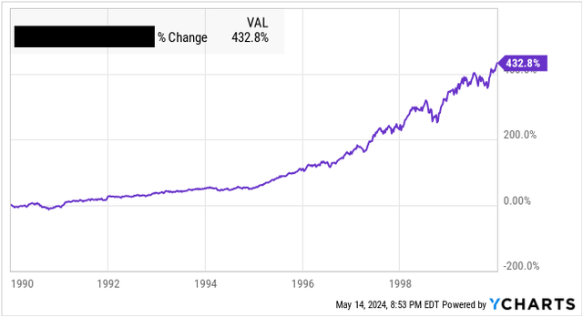
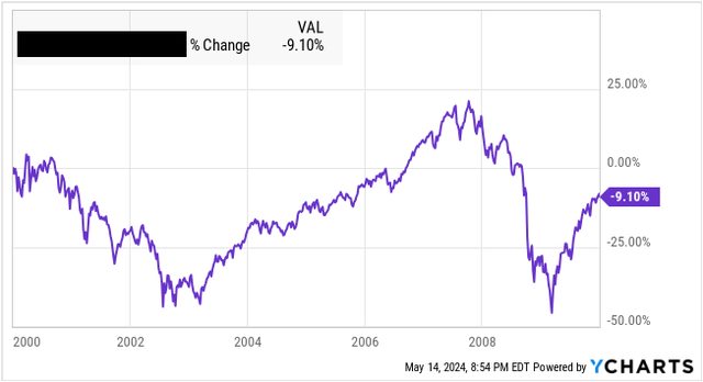
Which of these two investments would you choose? Here are the 10-year charts:
Investment A:
Ycharts
Or investment B:
Ycharts
Which one would you choose?
I’ll admit, this is a bit of a trick question. Investment A and Investment B are the same investment. Both are the total return of the S&P 500. The only difference is the starting year. The first chart shows 1990-1999, and the second 2000-2009. In other words, if you chose to buy Investment A, the second chart was your result. The S&P rocketed up in the 1990s and then went essentially nowhere for a decade.
If you found Investment A more attractive, reconsider your thinking. The problem with using past performance as a guide to current decisions is that the 10-year chart looks best when the current investment opportunity is the worst. The 10-year chart looks its worst when the current investment opportunity is the best.
This is a fancy way of saying that the best time to buy is when prices are low. Historical results will always look their absolute best when the price is at its highest point and their worst when it is at its lowest. After all, a price chart measures price.
Mistake #2 – Ignoring Dividends
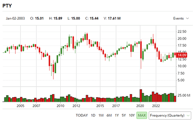
A lot of easily accessible charts on the internet only show share prices. For example, here is the chart for PIMCO Corporate and Income Opportunity Fund (PTY) since inception from Fidelity:
Fidelity
You can find similar charts on Yahoo, Seeking Alpha, Google Finance, and others. The chart shows PTY essentially breaking even over 20+ years, which is enough for many investors to walk away.
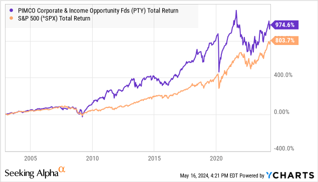
Yet, since its inception, PTY has outperformed the S&P 500.
Data by YCharts
How is this possible? Dividends are an integral component of total returns! I’d argue that it is a superior form of total return as it is cash in hand, which is more valuable than cash still at risk. The vast majority of stock charts default to price, and you have to change the settings to “total return” to get a real picture of prior returns.
This is especially true for investments where you can expect most of your returns to come as dividends – most notably, companies structured as RICs (Regulated Investment Companies). The Investment Company Act of 1940 requires RICs to pay out substantially all of their taxable income in exchange for paying limited taxes at the corporate level. As a result, companies with these tax structures tend to pay out a high yield, and the majority of returns will come as dividends. RICs include REITs (Real Estate Investment Trusts), BDCs (Business Development Companies), and CEFs (Closed-End Funds).
How to treat dividends in a chart is a complex topic. The YChart above uses “total return,” which means it assumes 100% reinvestment of the dividend. This is good for getting an “apples-to-apples” comparison of total returns, but it is not very realistic. An investor interested in receiving a 10%+ dividend like PTY pays is likely interested in cashing out at least a portion of that dividend!
Mistake #3 – Ignoring Withdrawals
Charts show what happens if you invest and don’t touch an investment over a period. If you are looking at “total return,” it will simulate reinvesting the dividends.
What I’m about to say isn’t going to make me very popular on Wall Street:
It is ok to withdraw your money from your brokerage. It is your money.
I understand that a lot of folks are in the accumulation phase and can reinvest 100% of their dividends and are adding more money every paycheck. That’s great; if you are in that phase, that is exactly what you should be doing. However, you will eventually get to the point where it is time to take the cash out. After all, you worked hard and likely made some personal sacrifices to set aside money for your future. The entire point of all those efforts was so that you could take money out!
Yet, most charting software offers you no way to simulate withdrawing money. An investment that might be completely fine, assuming no withdrawals, might look completely different if you assume withdrawals.
Portfolio Visualizer is a tool I like to use because it allows me to see past performance based on various withdrawal assumptions. Here is PTY compared to SPY using Portfolio Visualizer. Source

Portfolio Visualizer
PTY produced about 1% higher CAGR – not bad. However, if we modify our assumption to withdraw 7% of the initial investment each year, the difference in performance is much larger. Source

Portfolio Visualizer
Suddenly, PTY outperforms at a 7.2% CAGR compared to 2.97% – a massive outperformance using the same data source, the same time period, just changing the withdrawal assumptions.
Why does this happen? Because selling shares during a market crash is the most damaging thing you can do to your portfolio. The PTY position produced ample dividends to cover the cash withdrawals, while the SPY position did not. The PTY position was using excess cash to buy more shares during the GFC (Great Financial Crisis), while the SPY position was selling shares to fund the withdrawals every year, including during the GFC.
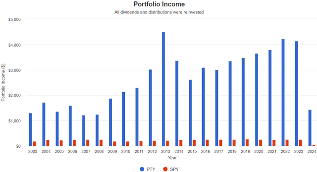
Portfolio Visualizer
When you are relying on selling shares to withdraw cash, the timing of those sales becomes extremely relevant to the health and longevity of your portfolio. Dividends provide cash flow that is distinct from the share price; when prices are crashing, dividends can be a source of cash that doesn’t require selling at poor prices. This is a dynamic that can’t be captured in most charting software.
While a stock’s total return might be fantastic, returns do not come in steady and predictable amounts. If your plan calls for selling stocks to free up cash, then you need to be aware of how that can significantly impact your total returns.
The Problem With Prices
Investors tend to obsess over price charts. I attribute this to most investors’ goals based on share prices. They phrase their goals as having $2 million by a certain age, which I’ve discussed previously as a very problematic goal.
Here is $1 million invested in SPY in January 2000 and using the “4% Rule”, which is withdrawing 4% in year one and increasing that withdrawal by inflation annually: Source

Portfolio Visualizer
If this person retired at 65, they are now 89 and have seen their $1 million fortune dwindle to under $350,000. They need to seriously consider whether to change their lifestyle or risk running out of money. We plan for retirement to avoid these types of situations.
Yet, if that person had $1 million in 1999: Source

Portfolio Visualizer
This retiree still has $1 million despite withdrawing $1.3 million in cash to fund their lifestyle over the decades. This is the difference a single year makes. The $64,000 question is, which year are you retiring in? 1999? 2000? 2001?
This is why I favor an income approach to investing and investing goals. A company’s income is much more stable and predictable. Yes, it can change, but these changes have more to do with the underlying company than the whims of the market.
Charts Aren’t Useless
Charts aren’t useless. I use them quite frequently. They take data and present it in a format that is visually easy to digest and identify trends. However, whenever you use a chart, you must understand what information that chart is conveying. Price is just one thing that we can measure with charts, and in my opinion one of the less useful measurements.
Since my retirement relies on the income my investments are producing, I am much more interested in the cash flow being produced. For example, if we look at CFO (Cash From Operations) per share from Realty Income (O) and EPR Properties (EPR) we see why the two companies had different experiences through COVID-19.
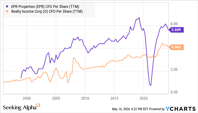
Data by YCharts
Yet, both companies have recovered, with O having materially higher earnings than it had pre-2020. Despite this, both are trading at lower prices than they were in January 2020.
In other words, the companies have higher earnings, but lower prices – also known as a buying opportunity. Of course, we don’t want to buy based on charts alone. The chart is simply a starting point that shows us where to direct our due diligence. If we knew nothing about these companies, we probably want to research why EPR had such a huge decline in 2020/2021. With both companies, we want to look at the near-term outlook and whether the longer-term trends are sustainable. This requires gaining an understanding of the business models and what drives them.
Conclusion
So many people approach the market with a “get rich quick” attitude. They follow cute memes, chase the crowd, or try to predict where the crowd is going to go next. The goal is to make a quick profit by being one of the first ones in and getting out before everyone else sells. You can make money doing that, but don’t be fooled into believing it is “easy money.” It also carries a significant amount of risk and requires a dose of luck to be successful. Over the decades, I’ve seen more Wall Street “prodigies”, “whiz kids”, or “gurus” than I can name. They have their 15 minutes of fame for some great call. Then, everyone forgets their names as they move on to the new trend.
The U.S. stock market has been one of the greatest sources of wealth creation the world has ever seen. As investors, we have the opportunity to invest in it and own portions of the companies that provide our everyday products and services. The value of a stock is not in whether or not you can find a sucker to pay you more for it in the future. The value is in owning the underlying company.
My strategy is to own profitable companies that are providing me with my cut of the profits through dividends. A good company is going to continue paying dividends to me long after the memes are gone. It will pay me dividends through recessions, bear markets, wars, times of uncertainty, high interest rates, low interest rates, and boring times.
The difficult part of investing is to identify those companies. However, when you do, and you buy them up, you will find yourself a lot less distressed about the swings in their market price. You will be able to identify when a downward swing in price is a sale allowing you to buy income at a lower price or when there are fundamental issues with the company that might be putting your dividends at risk. These are things a price chart simply can’t tell you. Yet, so many investors will prize the price chart over any other data. For investors willing to dig a bit deeper, they can find opportunities to increase their income from the good companies that the market leaves behind while it loads up on the latest fad.


