Especially without an in-person brick-and-mortar store experience, it’s critical for ecommerce businesses to establish a recognizable brand that atttracts customers and stays front-of-mind.
Your brand influences how customers feel when they buy from you. A strategic brand strategy can encourage referrals, set expectations, and give ecommerce businesses a more human feel—ultimately keeping shoppers coming back for more.
But what are the elements of a memorable brand? And how can you make your brand stand out in a crowded market? Ahead, learn about 14 inspiring ecommerce brands, and get practical takeaways you can apply to your own brand to maximize ecommerce sales.
14 ecommerce brands to inspire your online store
- Fishwife
- Alfred
- Pipcorn
- Dossier
- Beauty Pie
- Bittermilk
- Olipop
- Meow Meow Tweet
- Welly
- United Sodas of Ameri
- Nerdwax
- Tsuno
- Velasca
- Our Place
Whether an ecommerce company uses an online marketplace or is powered by an ecommerce platform, there are inspiring examples everywhere. If you have a budding ecommerce startup, look no further than the brands that have paved the way before you.
Explore these ecommerce brands discover what makes them successful. As you design your own online store, market your business, and set sales goals, let these examples guide you.
1. Fishwife
A fresh take on traditional tinned fish, 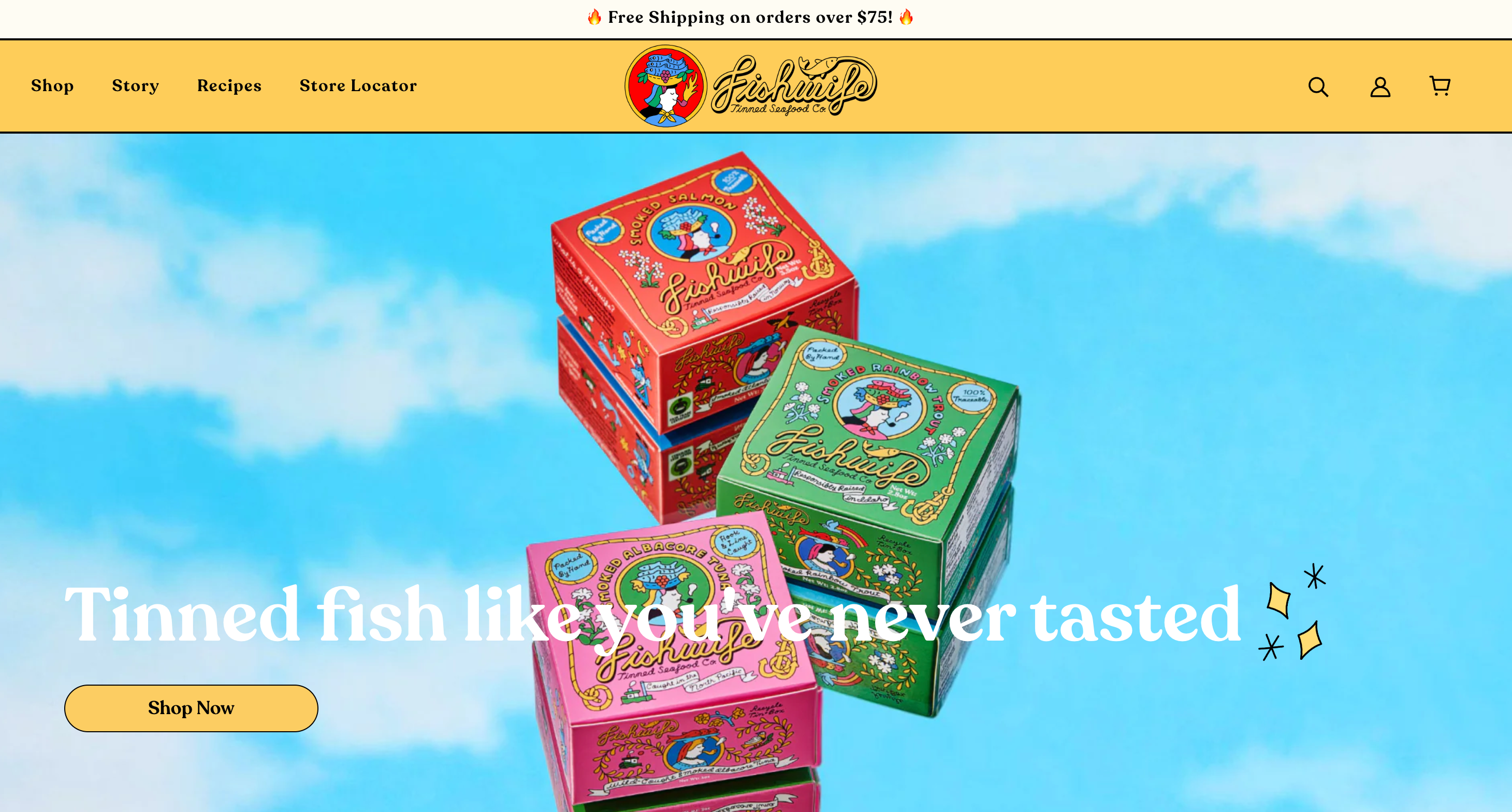 Fishwife is a female-founded DTC brand that’s transformed a cupboard staple into a hip must-have.
Tinned seafood is hardly glamorous, but Fishwife uses bold colors and swirling fonts to bring an old-fashioned food product into the present day. The brand uses nostalgic, sepia-toned imagery overlaid with bright, primary colors to provide an eye-catching contrast and invokes a sense of nostalgia with shoppers.
Further down the homepage, customers can see a selection of bestsellers, each of which boasts vibrant packaging that adds to the fun branding. This will no doubt help Fishwife stand out among other tinned fish brands on supermarket shelves and in search engine results pages (SERPs).
Key takeaway: Research how brands similar to yours present themselves, and consider how you can do things differently. Refreshing a tired old industry with a simple splash of color or stand-out branding can elevate you above the competition.
2. Alfred
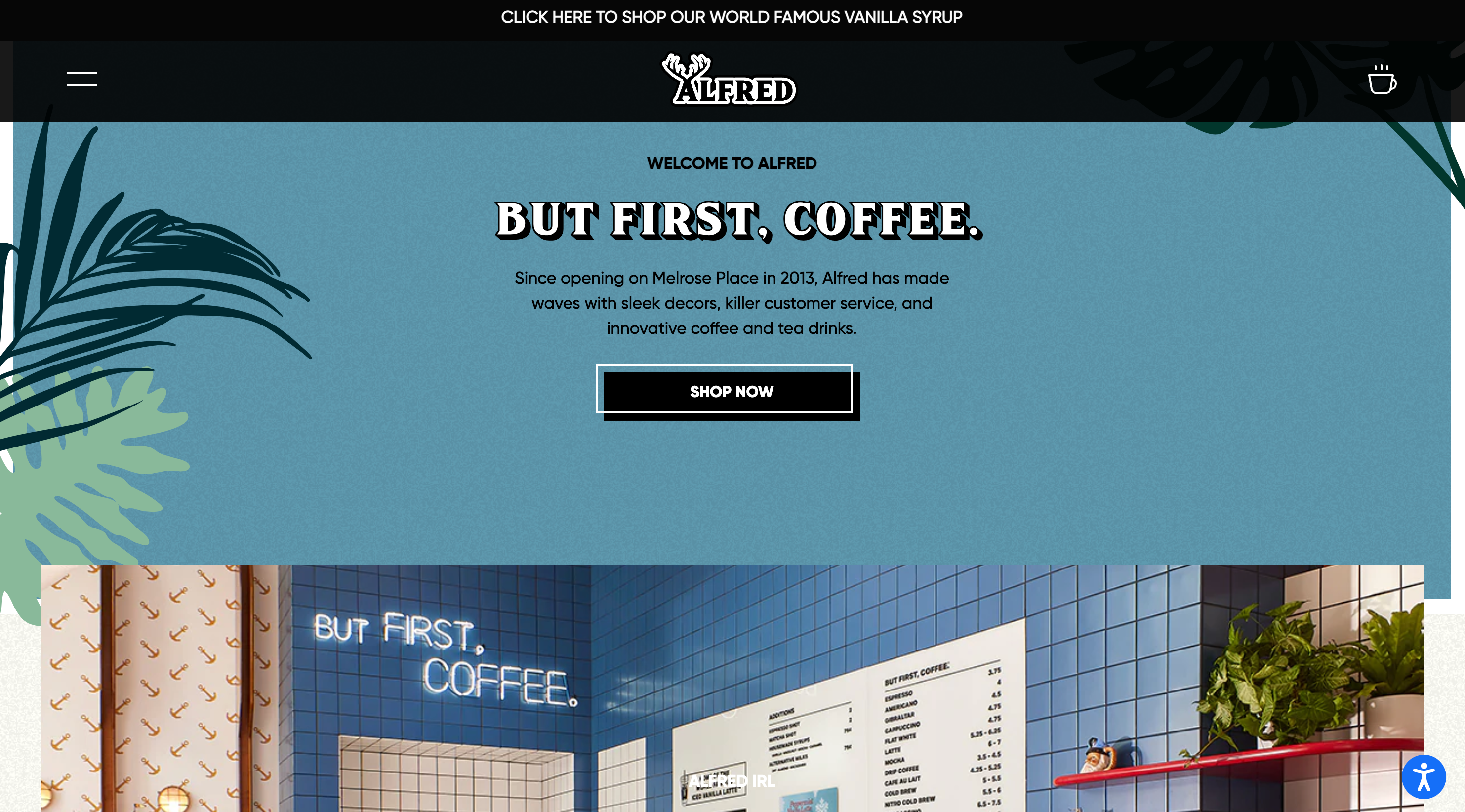 Coffee is a competitive industry right now. Stay-at-home orders during the pandemic saw people ordering in their favorite beans to get their morning caffeine kick, posing a problem for retailers seeking a consistent brand.
Coffee brand Alfred began as a humble coffee shop in Los Angeles before branching out to other locations across the US, as well as in Kuwait, Saudi Arabia, and Jordan. Alfred combines its in-store presence with an eye-catching online store. The homepage hero image features a mouthwatering series of close-up coffee clips, while illustrations and outlined fonts create a nice contrast to the hyper-realistic content.
It’s important for Alfred to create a cohesive brand across its physical locations and online store. Having bold fonts, a limited color palette, and a collection of illustrations to pull from means it can switch up the design in each location without losing its sense of brand.
Key takeaway: Have several brand assets you can use to create a cohesive design across your online store and physical locations (if you have them). You can pick and choose which elements to include while maintaining a recognizable brand.
3. Pipcorn
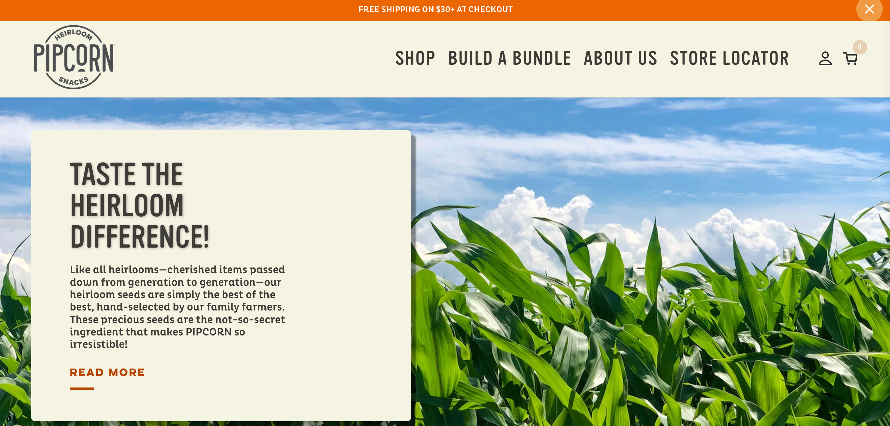 Pipcorn was the brainchild of a family of founders who discovered heirloom corn during a house move. They went on to reinvent their favorite childhood snacks with a delicious taste and plenty of natural ingredients.
The Pipcorn website has an organic feel to it, with neutral colors that match its packaging. Illustrations and videos bring the product to life in a series of clips, giving the heirloom snack a personality that consumers can connect with.
One of Pipcorn’s biggest selling points is its natural ingredients that turn a tasty snack into a health-minded one. The brand’s organic undertones reflect the company’s health focus, instantly connecting with shoppers when they land on the site.
Key takeaway: Ensure your branding reflects your values and biggest selling points. Just like Pipcorn uses natural colors to highlight its commitment to using natural products, consider how you can present your product’s unique selling proposition through colors and imagery.
🍿 Learn more: Pipcorn’s popping success relies on relationship-building
Jen Martin and her co-founders launched Pipcorn with the aim of creating an easy to digest snack. Find out how supplier relationships played into their success. 👉 Listen to Jen’s story
4. Dossier
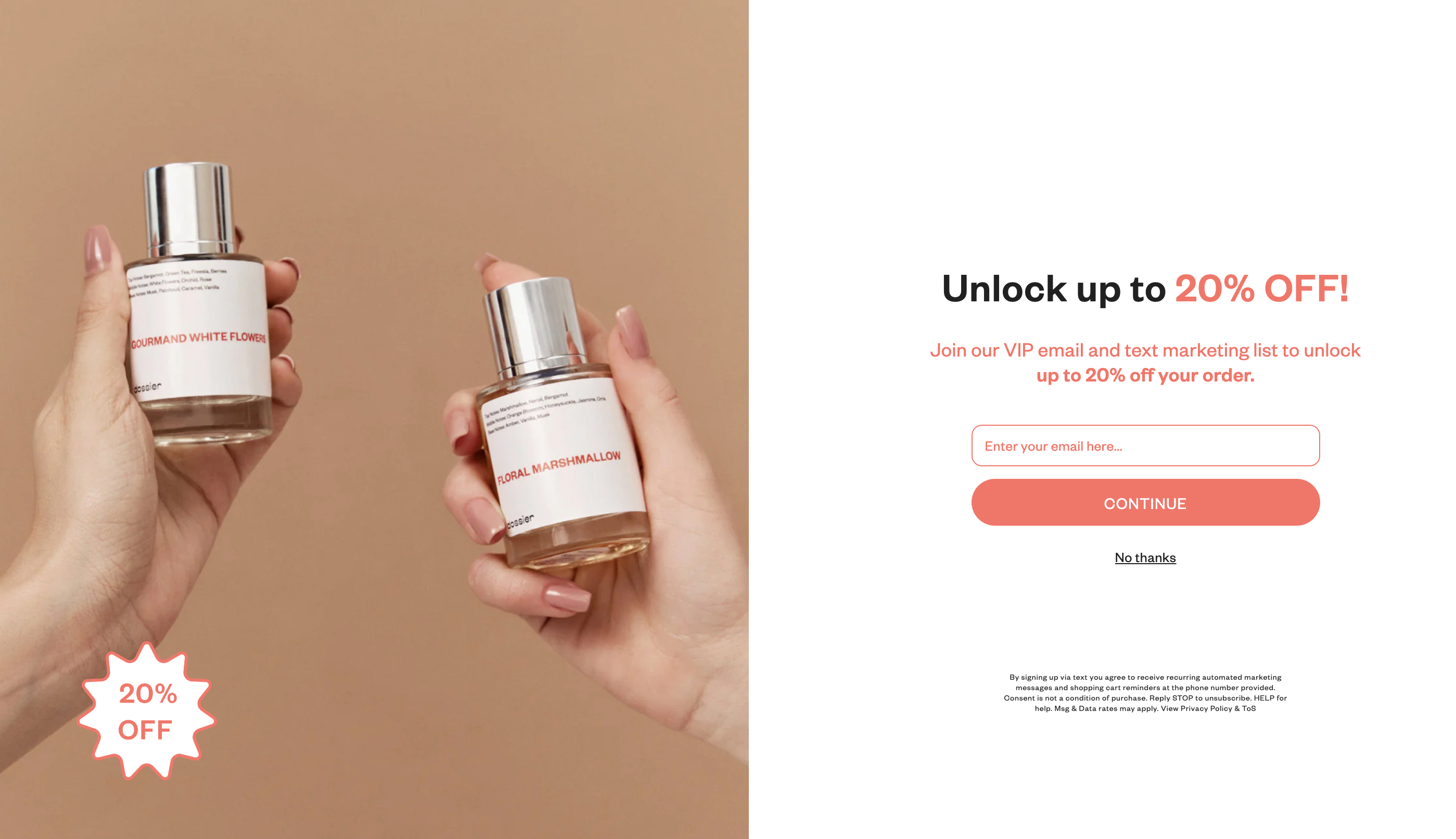 Dossier is on a mission to sell perfume at cheaper prices. It plans to bring what’s considered a luxury product to the masses so that special scents can be accessible to all.
Despite its affordable pricing, Dossier pulls elements from luxury design to give its brand a high-end feel. There’s lots of white space, bold modern fonts, and a limited, neutral color palette. Further down the page, shoppers can browse a selection of products that are displayed simply in a neutral beige box. Even the packaging aligns with the luxury, minimalist vibe—white labels feature small flourishes of black and red text.
Key takeaway: Make sure your branding reflects the brand you want to be perceived as. If you want to present a high-end feel, use luxury design elements, like white space, neutral tones, and clear, modern fonts. Psychological design is a useful tool for invoking specific feelings and generating actions from website visitors.
Related article
50+ Best Shopify Stores to Inspire Your Own (2024)
What makes a Shopify store stand out? Get inspired by more than 50 inspirational and beautiful ecommerce stores.
5. Beauty Pie
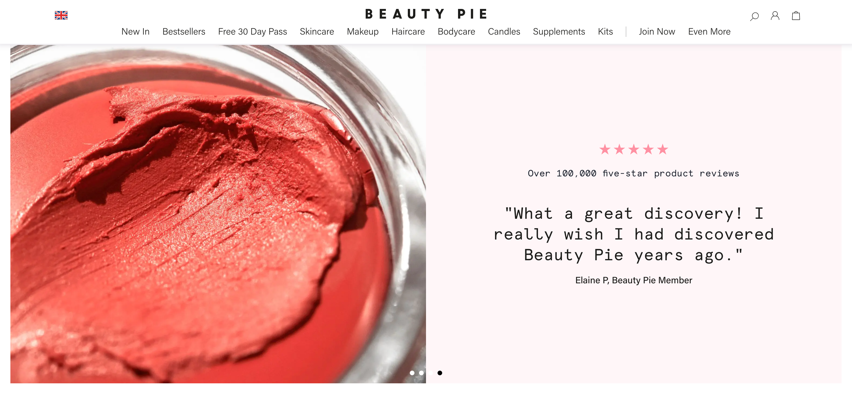 Beauty Pie is a cosmetics subscription service that offers shoppers access to products directly from beauty labs so they can bypass retailer markups.
The brand uses image-based graphics to highlight its unique selling proposition and the key benefits of the product. And, because it has such a large social media presence, it incorporates social media design elements into its brand. These include things like square-shaped product images, product tags, and user-generated content lifted directly from social media.
Key takeaway: Use your design and branding to highlight your unique selling proposition. It’s important that shoppers understand what you’re selling and why they need it straight away, so use images and illustrations to show this from the get-go.
6. Bittermilk
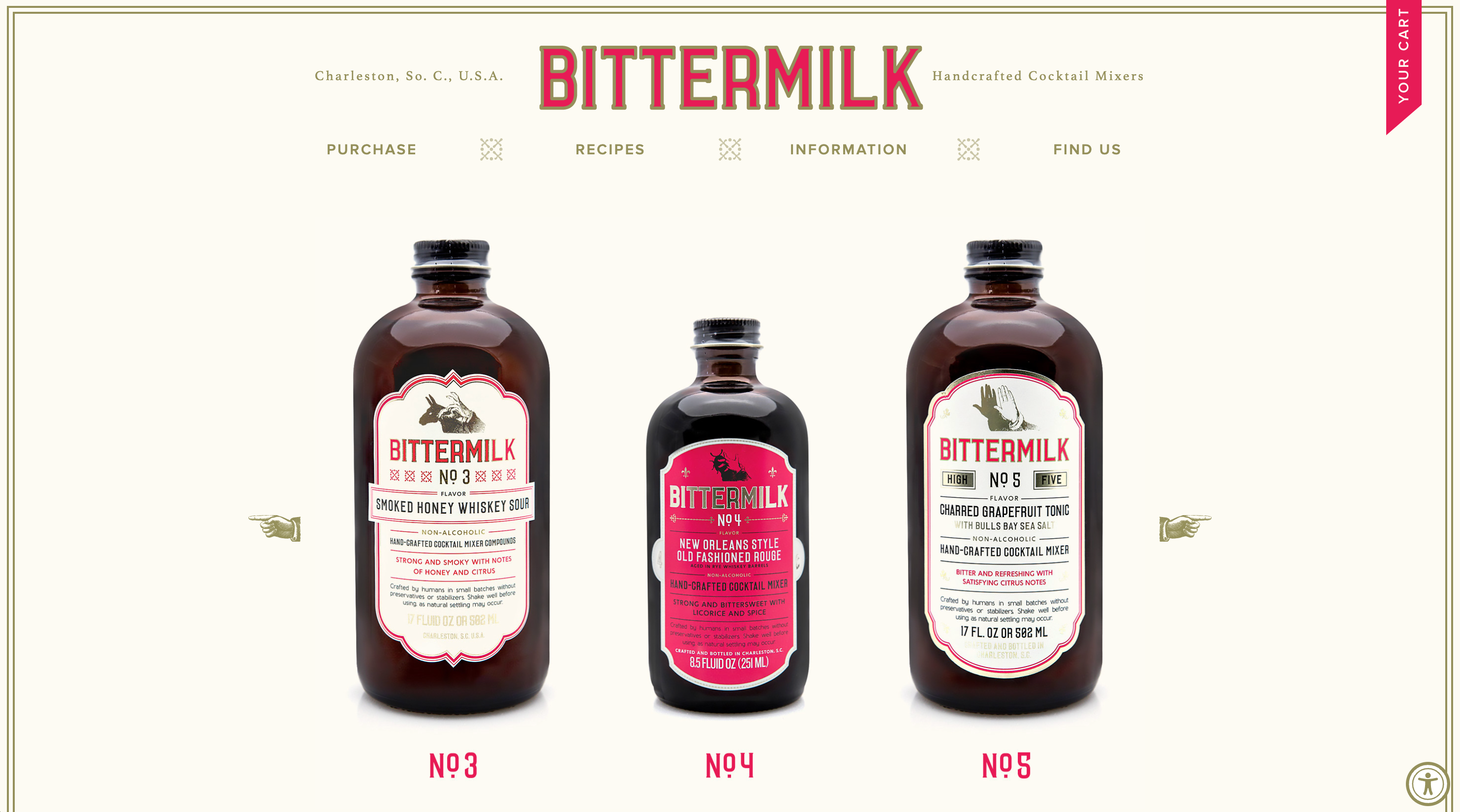 Bittermilk brings professional-level cocktails into everyday homes. Started by a team of mixologists, the brand sells hand-crafted mixers—all the customer has to do is add a dash of booze.
Bittermilk’s brand takes inspiration from vintage apothecary design. The ecommerce website is a limited mix of three colors, and the rest of the store follows suit. The site is light on information, and instead lets its products do the talking. Apothecary bottles are back on trend, and Bittermilk has latched onto this with pharma-style packaging that’s distinctive from other cocktail mixers on the market.
Key takeaway: Draw inspiration from the history of products in your category, and try reimagining it for a modern customer. If other packaging in your industry uses bold colors and loud fonts, try differentiating with muted tones and a simpler look.
7. Olipop
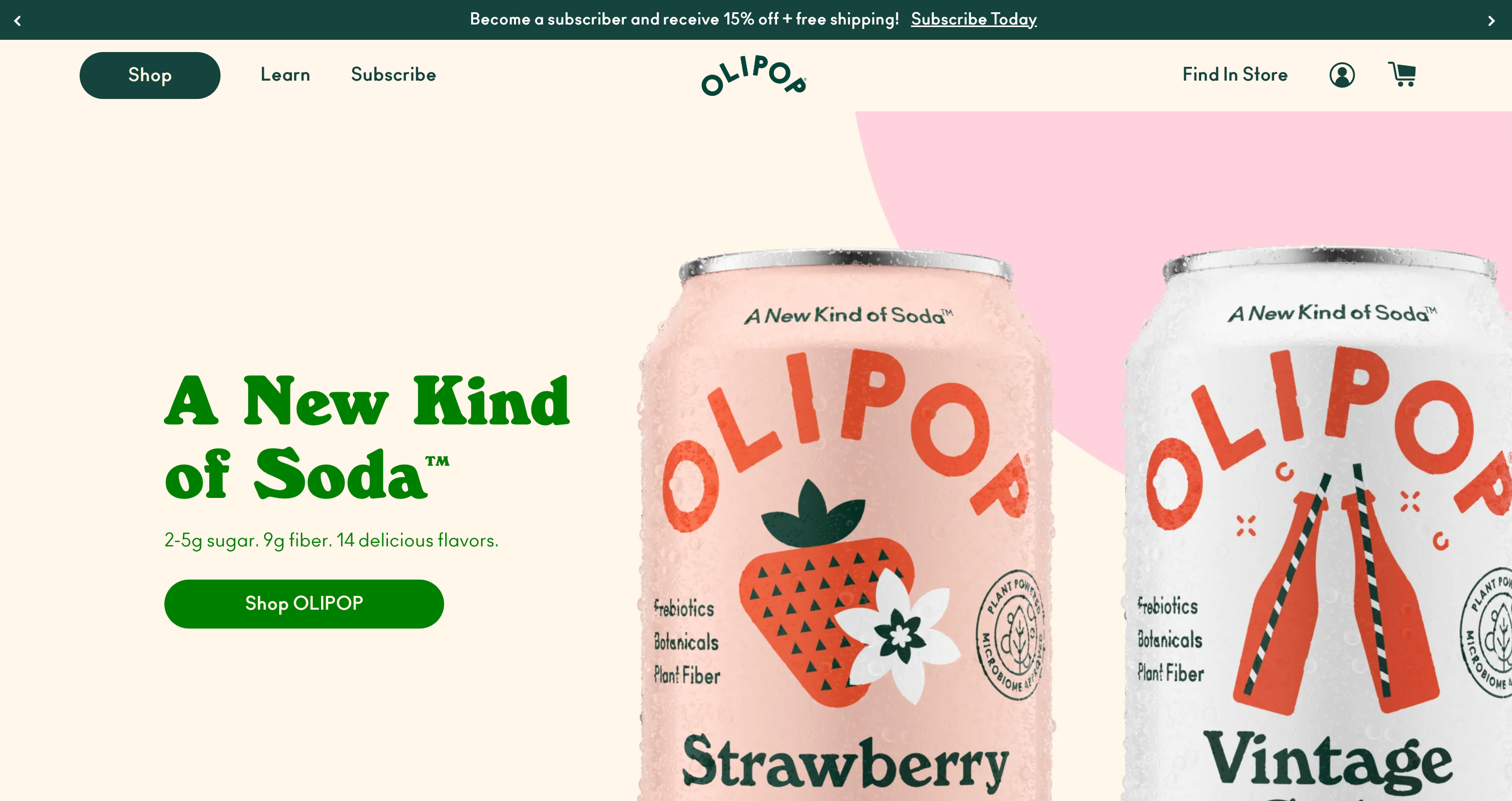 Olipop is a popular soft drink brand that has created healthier versions of classic childhood flavors.
Oilpop capitalizes on bright, airy colors that reflect the flavor-focused product inside its cans. The website features a pastel color palette and puts the product front and center to highlight that what you see is what you get.
Branding can be a great way to add context to a product—for example, the light colors and fun, playful branding of Olipop encourages thirsty shoppers to feel a certain way when they buy from the brand.
Key takeaway: Consider how you want customers to feel when they shop with you. Do you want them to feel relaxed and summery? Or what about warm and cozy? The colors you use will influence how shoppers feel, so use your palette wisely.
🎧 Listen: Olipop’s products blend health with taste
JAfter discovering the importance of microbiomes and their impact on nutritional health, Ben Goodwin was inspired to launch his creative soda brand, Olipop. 👉 Hear Ben’s story
8. Meow Meow Tweet
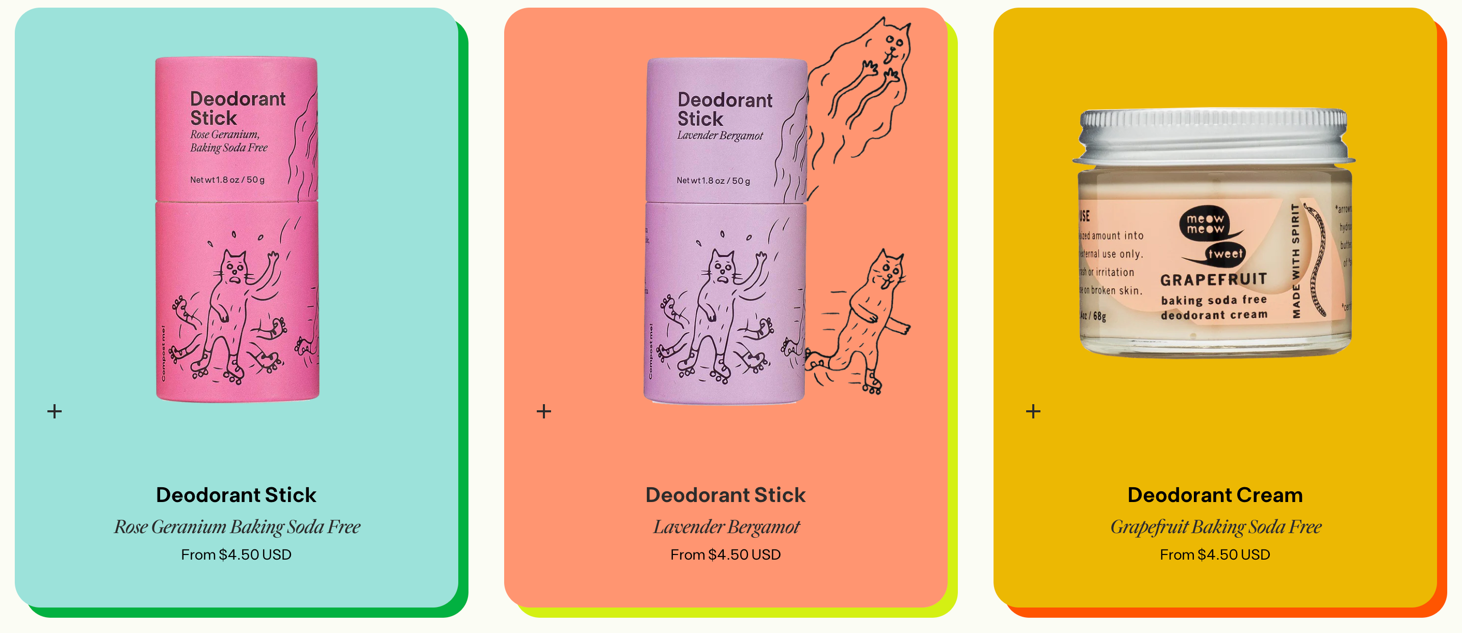 Meow Meow Tweet is a sustainable brand dedicated to creating pure, all-natural formulas for everything from insect repellant and face cream to deodorant.
Product images are integral to an ecommerce brand, but so is the way you present the products on your site. Meow Meow Tweet adds fun, playful elements to its design with the help of whimsical illustrations. The drawings are showcased on both the packaging and across the brand’s website, from the homepage and product pages to the checkout.
Key takeaway: Add your own stamp to your brand with illustrations. These can be used on your packaging and across your website to bring together physical products with the digital design of your online store.
9. Welly
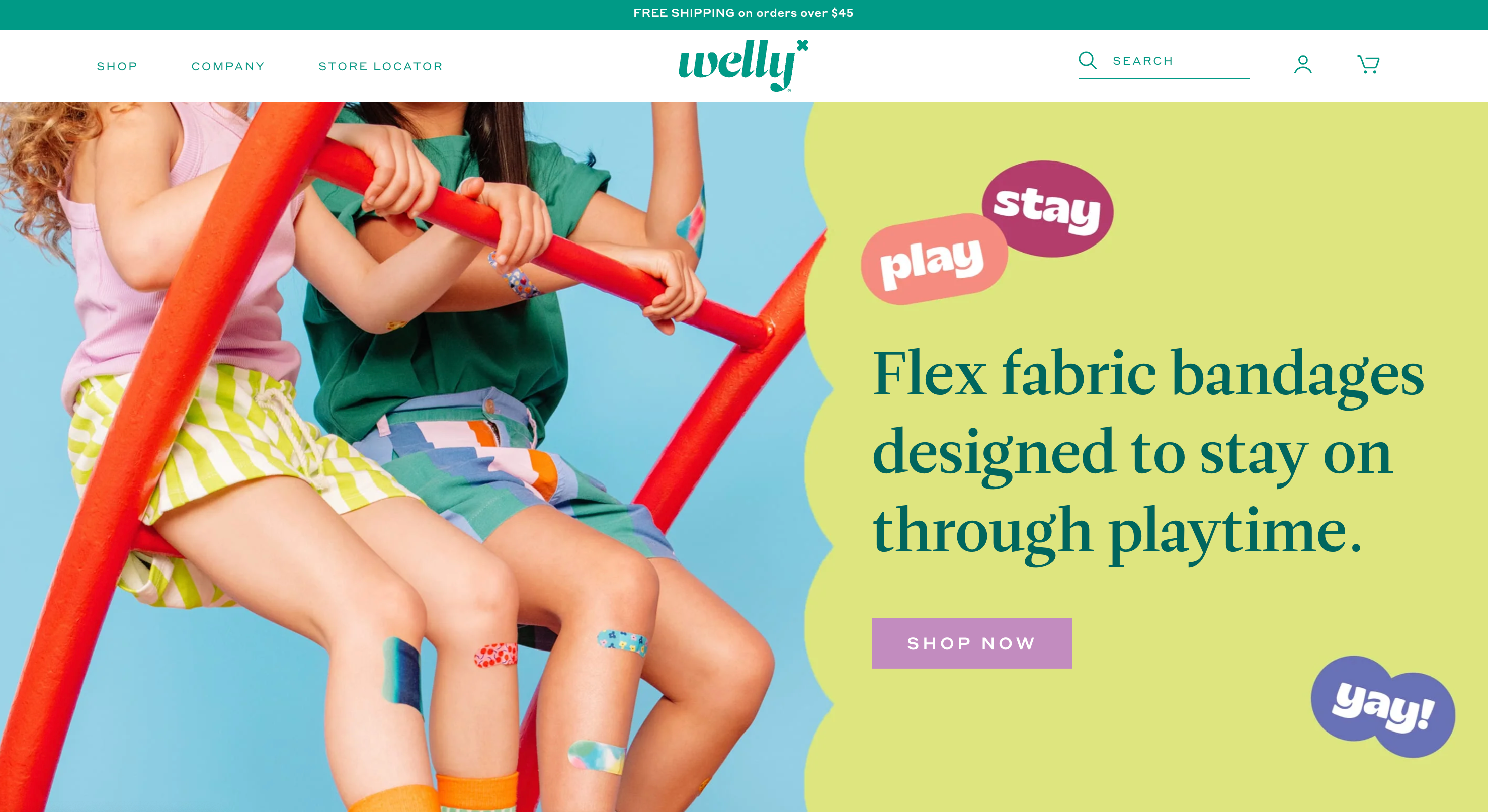 Welly puts a fun spin on bandages and other first-aid items with bright designs perfect for the whole family.
Bandages aren’t a particularly fun product to promote, but Welly manages to make them stand out against plain drugstore counterparts with bright colors and playful designs. The brand is all about encouraging adventures while making sure you’re prepared for them. Its website reflects that adventurous feel with bright, natural colors that are reflected in the product packaging.
Key takeaway: Give a serious product a lighter spin with bright colors and fun imagery. Think about the message you’re trying to promote and use that to drive your branding.
10. United Sodas of America
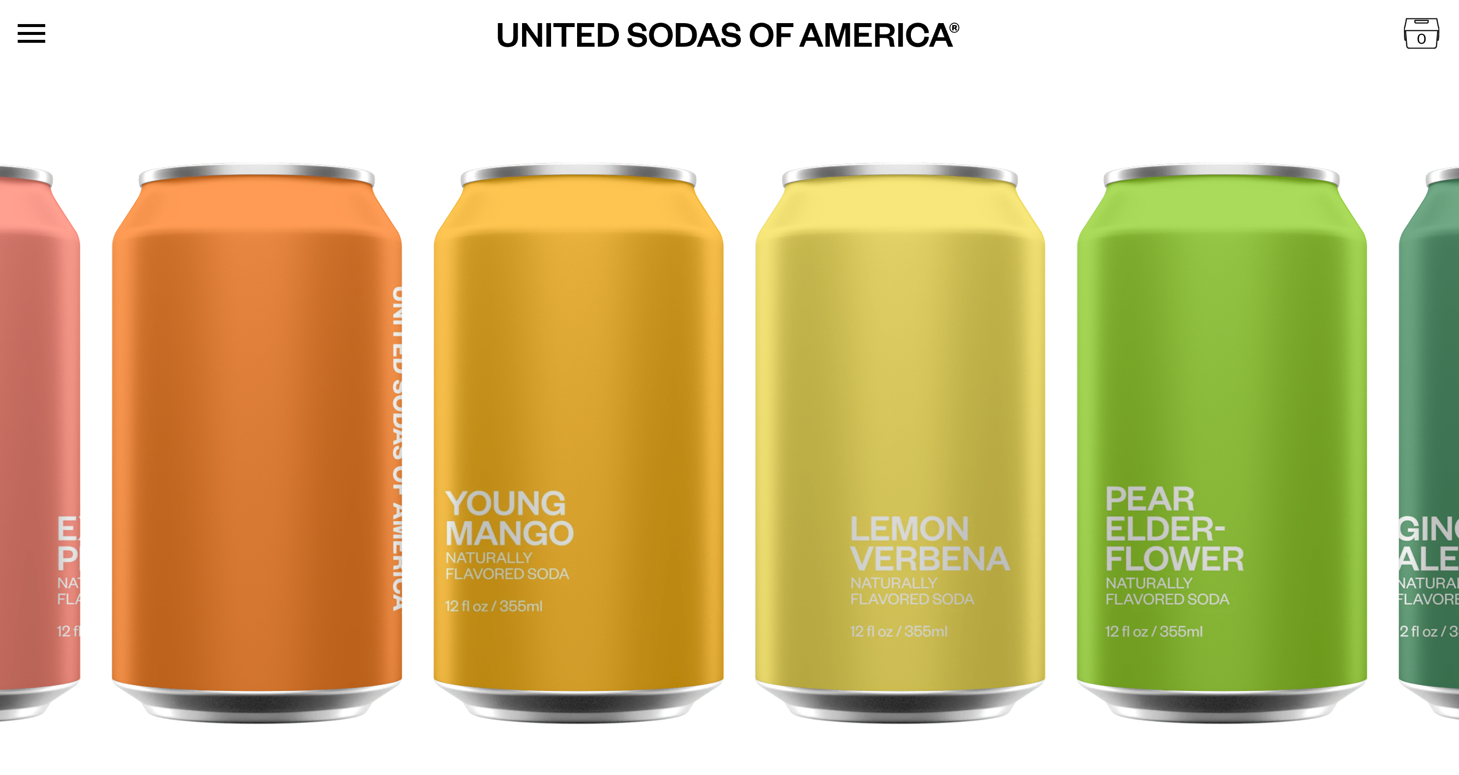 United Sodas of America sells naturally sweetened sodas in a variety of different flavors for a low-calorie, healthy twist on classic favorites.
This is a prime example of how branding can affect the way shoppers think and feel about your brand. While Olipop and United Sodas of America both sell health-focused sodas, their respective branding couldn’t be more different. Whereas Olipop presents a kitschy, summery vibe, United Sodas of America is more starkly bold, relying on sans serif typography, a cool-toned color palette, and lots of white space for a more minimalist feel.
Key takeaway: Your branding can make all the difference when standing out from the competition. The way your fonts, colors, and product photos work together will create the overall feeling shoppers have when they’re on your site. This is what will differentiate you from the competition, no matter how similar it is.
11. Nerdwax
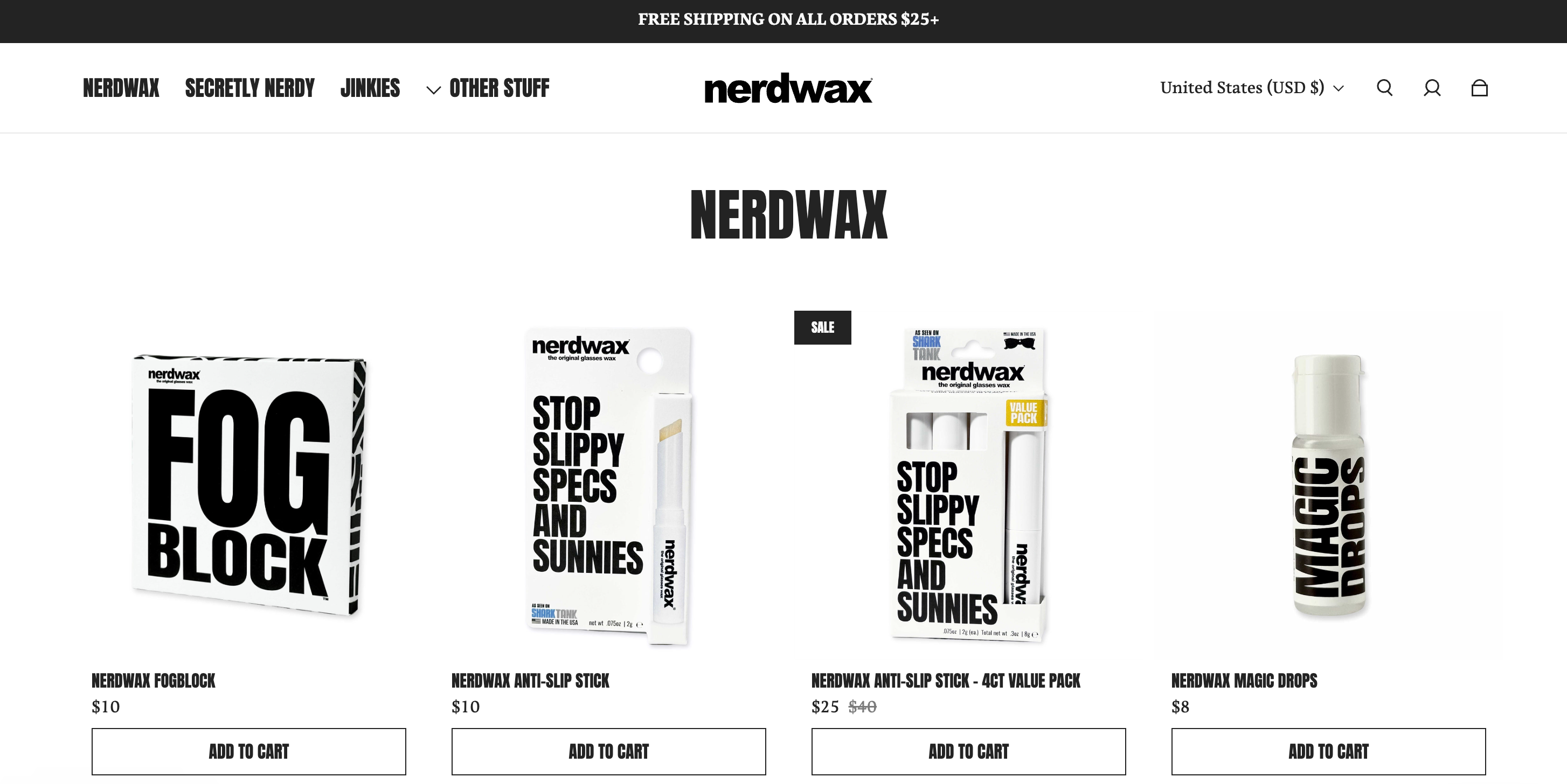 Nerdwax has created an all-natural beeswax formula to stop glasses from slipping off noses.
Unlike other brands, Nerdwax has gone all in on one product (with a limited number of spin-off products introduced since launch). Its beeswax formula is the star of the show on its website, and all the other design elements revolve around it. Huge, bold fonts bring the site to life, while the limited color palette reflects the natural ingredients and creates contrast with the huge amounts of white space.
Key takeaway: If your product line is limited, make your branding all about that product. Use big fonts and color to bring attention to product photos and important information.
12. Tsuno
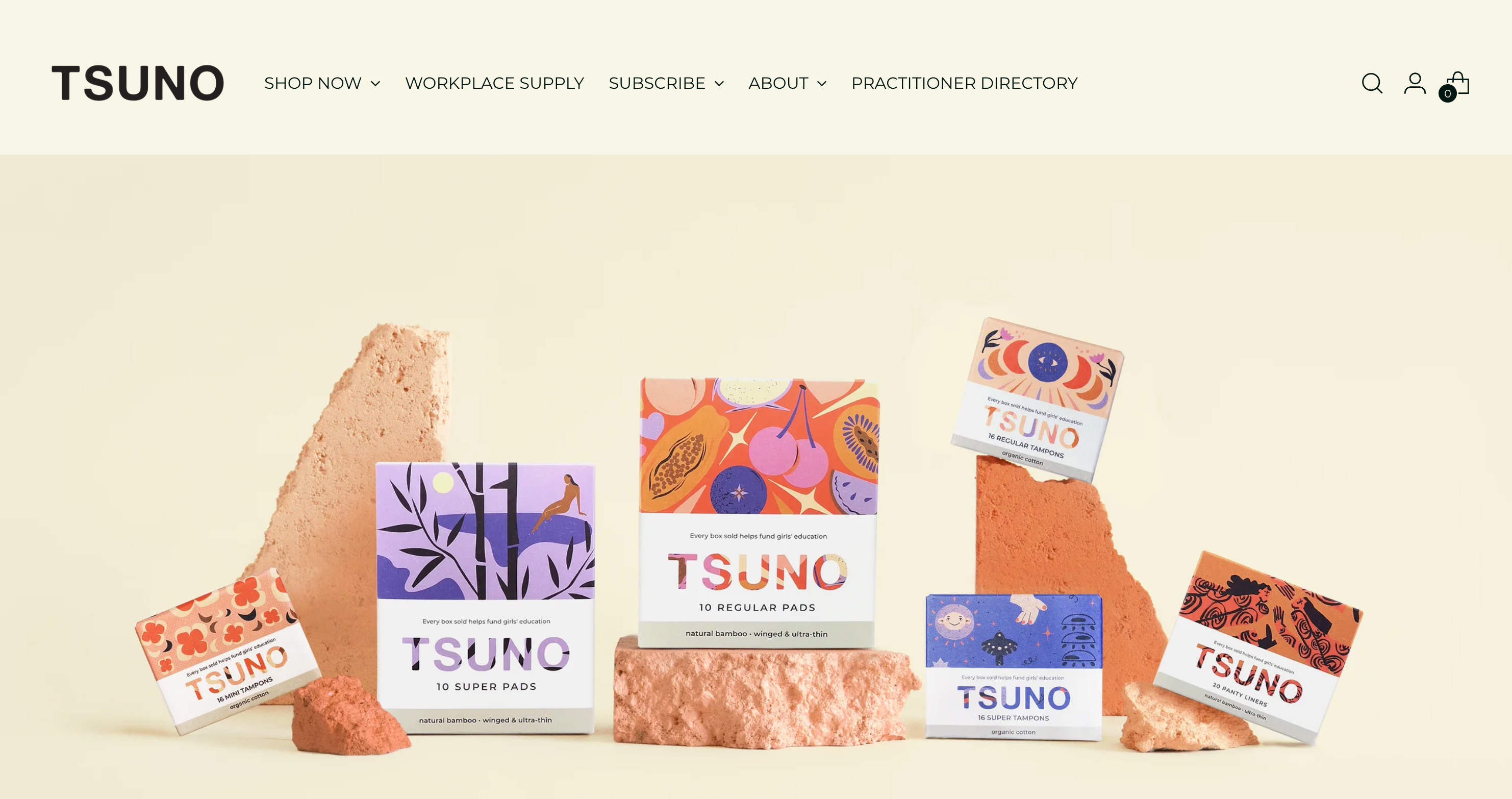 Tsuno is a social enterprise that sells sustainable bamboo fiber sanitary pads and organic cotton tampons.
Tsuno is part of a growing industry that promotes organic, sustainable feminine hygiene products and sanitary wear. As well as selling products made from natural materials, it’s also a social enterprise on a mission to help girls and women around the world.
The brand’s website reflects both of these endeavors with vibrant colors and illustrations paired with bold images from its initiatives across the globe.
Key takeaway: Highlight your values alongside your products. Use high-quality images to share photos of your products as well as to detail what purpose-driven initiatives you’re a part of.
🌸 Read more: Tsuno’s founder built a brand with a cause
Roz Campbell was moved by learning that many girls in developing countries miss schools because of lack of access to feminine hygiene. 👉 Read Roz’s story
13. Velasca
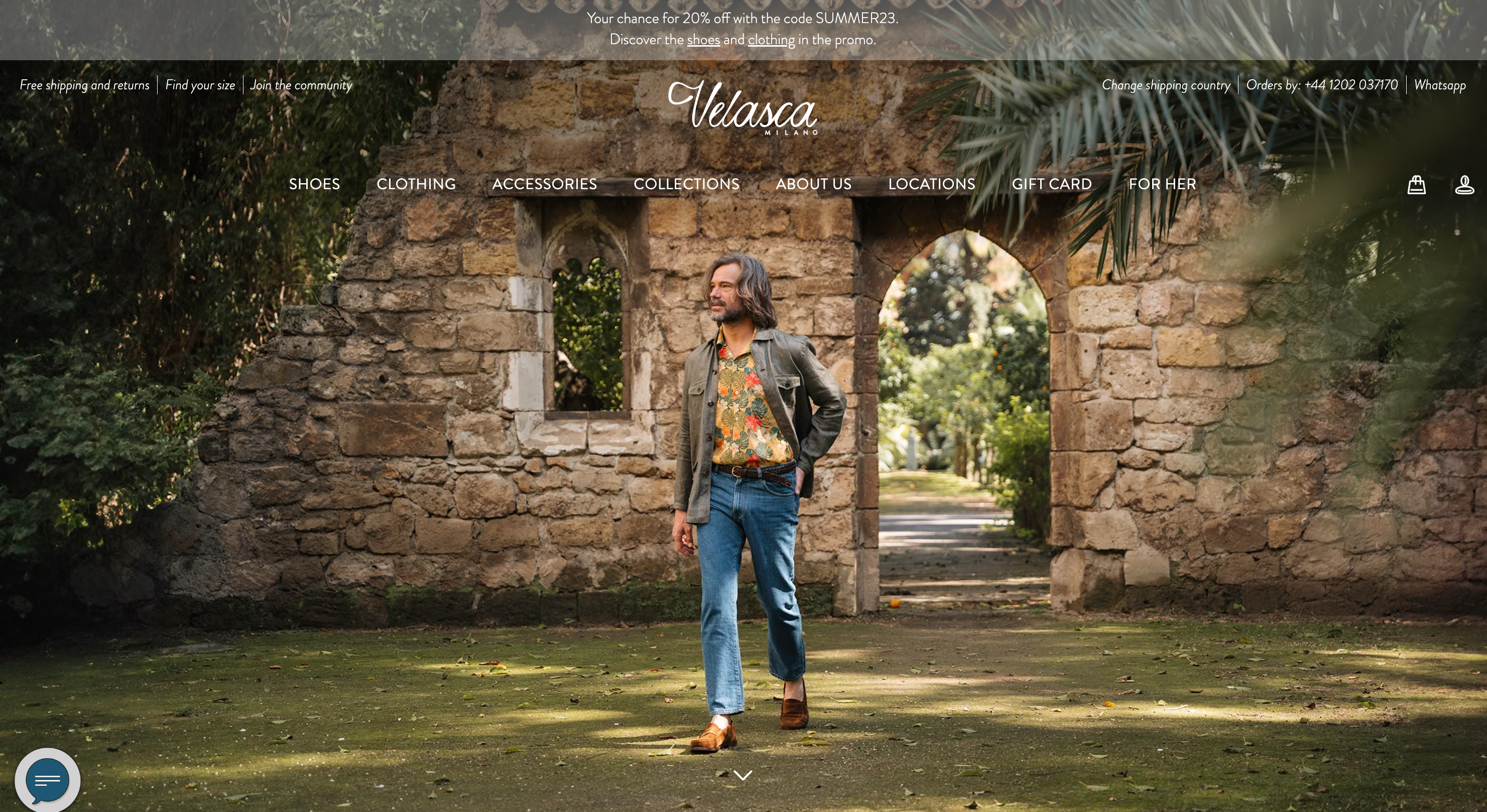 Velasca removes high-end shoe middlemen by selling footwear made in Italy straight to consumers, bypassing online retailers and third-party sellers.
Velasca’s brand is centered around high-end footwear from Italy—a region known for upscale, hand-crafted shoes. To reflect this, its website features beautiful photography of some of Italy’s most iconic landmarks. Each photo is bathed in the same filter to provide a nostalgic feel that the brand hopes to transfer to shoppers.
Key takeaway: Create a personalized experience for customers from start to finish by using beautiful photography that influences them to feel a certain way.
14. Our Place
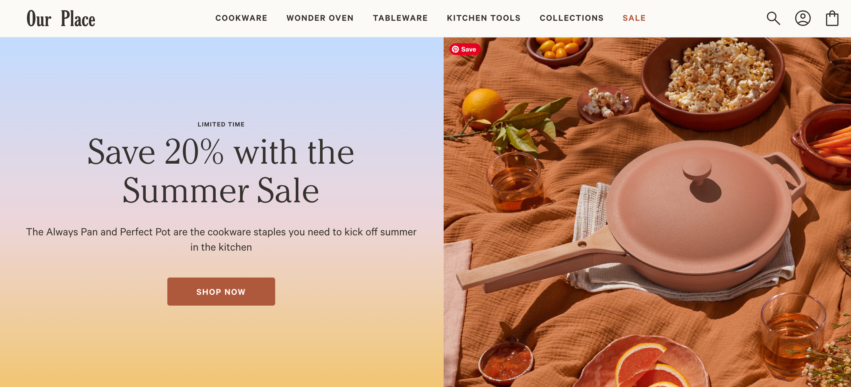 Our Place’s product range is made up of luxury pots and pans that were built to look and cook beautifully.
Our Place shows off the quality of its products with elegant lifestyle photography of the pans in action. The star product is dubbed the “Always Pan,” and so the brand shows it in all sorts of use cases throughout the site.
This helps shoppers get a feel for a product they can’t see or touch in person, increasing the chances of conversion and retention.
Key takeaway: Show your products in action. If people can see how your product can be applied to a variety of different use cases, they’re more likely to relate to your product and invest in it. Consider adding video to your content strategy, with demos embedded on your website, TikTok videos, and YouTube marketing.
Top branding tips for online stores
As you’ve probably realized by now, the most influential ecommerce companies—from a wellness startup to a DTC drink brand selling nostalgic soda flavors—have one thing in common: great branding.
Branding is more than just a logo. Branding defines everything from your mission and values to your brand voice to the colors and fonts you use to build your online store. Ecommerce branding can seem daunting, but it’s an important first step—before you even think about selling products.
Here are some tips to get you started:
- Define your brand story, including your mission and values.
- Establish a brand voice that will be consistent across marketing campaigns and customer touchpoints.
- Invest in branding design, including deciding on a palette, logo, and the look and feel of your website and photo shoots.
- Leverage free online tools or hire a pro: there are branding solutions for every budget.
- Follow consumer buying trends and understand your audience.
Inspiration for ecommerce business owners is everywhere
The way your site looks is important for first impressions, but you also need to deliver a great customer experience and keep shoppers coming back for more. The most successful ecommerce business owners know that branding extends beyond color and logo. Branding also defines and centers the customer so that each visitor has a personalized experience that builds brand affinity and keeps them coming back.
Ecommerce brands FAQ
What are the top ecommerce companies in the world?
Some of the largest ecommerce companies in the world are Amazon, Home Depot, Walmart, Alibaba, eBay, Rakuten, Shein, and Prosus. Ecommerce marketplace Amazon is by far the largest, bringing in $574 billion of revenue in 2023.
What are the best ecommerce companies?
The best ecommerce companies are Amazon, Shopify, and Etsy. Amazon is an online marketplace where shoppers can buy millions of products from a range of different categories. Shopify is an ecommerce platform allowing small businesses, DTC brands, and ecommerce companies to build an online storefront quickly and easily with a number of powerful integrations and design opportunities. Etsy is another online marketplace catering to handmade sellers and vintage resellers.
How many ecommerce brands are there?
There are estimated to be between 12 million and 24 million ecommerce brands in the world. This number is growing every day, with new brands popping up on an almost hourly basis. Ecommerce companies range from small handmade brands selling goods on Etsy to creator brands operating online stores to enterprise-level multinational chain brands selling anything from beauty products to home appliances.
What makes for a successful ecommerce brand?
Successful ecommerce brands are those that are able to differentiate themselves from the competition and highlight a unique selling point. They answer a specific pain point consumers might have and provide a solution for it. As well, they’re able to generate consistent online sales, encourage referrals, and have a high customer retention rate. The top ecommerce companies know how to tell a story, offer value, and create a seamless online shopping experience.


