By Lambert Strether of Corrente.
The Centers for Disease Control (CDC) has launched — don’t call it a dashboard! — a new page, called the “Respiratory Illnesses Data Channel.” It’s even worse than you could have imagined. CBS’s invaluable Alexander Tin(1) describes it in “CDC launches new way to measure trends of COVID, flu and more for 2024“:
The Centers for Disease Control and Prevention has launched a new way for Americans to look up how high or low levels of viruses like COVID-19 and flu are in their local area for 2024.
This year’s new “community snapshot” is the CDC’s latest attempt to repackage its data in one place for Americans deciding when to take extra precautions recommended in its guidelines, like masking or testing, going into the fall and winter.
The page is titled “Respiratory Illnesses Data Channel.” Although “Community Snapshot” is subtitle on that page, we’ll follow Tin in using that name (or “Snapshot”). More:
It centers around a sweeping new weekly metric called “acute respiratory illness.” The metric’s debut fulfills a goal laid out by agency officials months ago, aiming to measure the risk of COVID-19 alongside other germs that spread through the air on a single scale from “minimal” to “very high.”
here and here) but I don’t know whether Tin’s use of the term is purposeful or not. More:
“The biggest thing we’re trying to do here is not just to have a dashboard. It’s not just putting a bunch of information in front of people and kind of expecting them to navigate all of that,” the CDC’s Captain Matthew Ritchey told CBS News.
(No, Captain Ritchie, that’s the rest of CDC’s site, over which which this “Community Snapshot” is a layer, and a rather thin and ineffectual one at that, for some definition of “ineffectual.”) Unfortunately for us all, Snapshot’s “sweeping new metric ” is useless, its nosology is wrong, its messaging is an example of Covid minimization, it makes personal risk assessment difficult, its paradigm (seasonality) is wrong, it erases non-pharmaceutical interventions despite advocating layered protection, and the process by which its data will be aggregated is both non-transparent and likely to be politicized. In short, CDC’s “Community Snapshot” is just as bad as you would expect it to be. I’ll present (Figures 1–3) annotated Snapshot screen dumps that show these points, and conclude with speculations on how this horrid entity came to be.
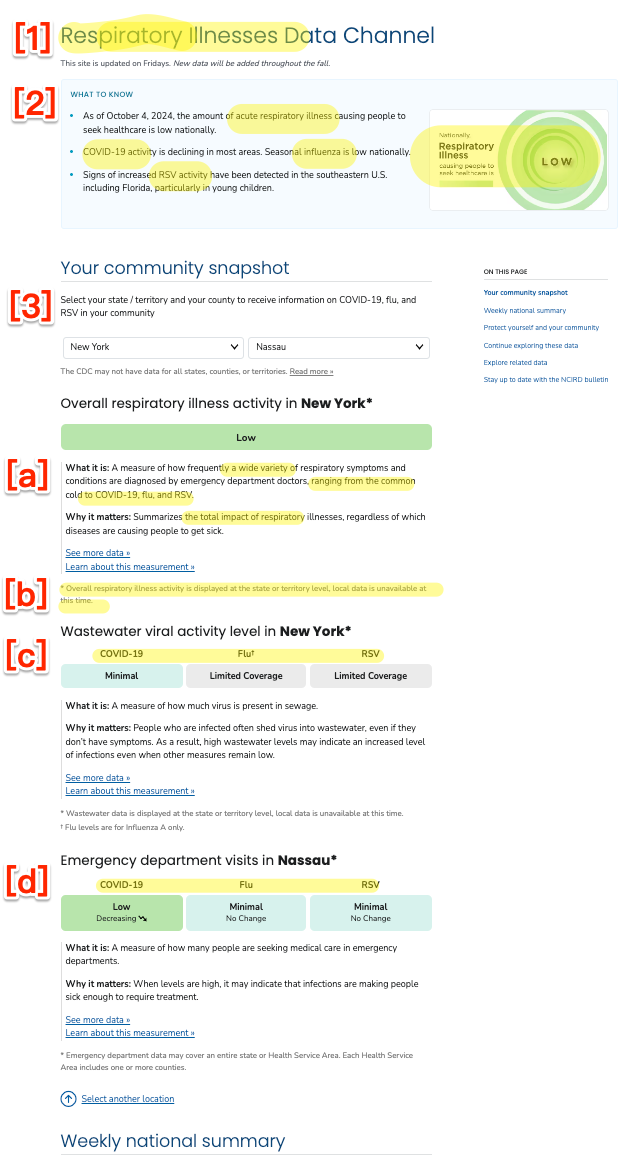
Figure 1: (a) “Respiratory Illnesses Data Channel”

The New Weekly “Respiratory Illness” Metric: Useless
In Figure 1 (a) at (1) and (2), we see that the “Respiratory Illnesses” of Covid-19, the flu, and RSV are all lumped together into a single “National” metric. There have been other phrases for this lumping (“tripledemic,” “pan-respiratory model“) although Tin settled on “topline figure.” But who does this “topline figure” help, exactly? It certainly doesn’t help an individual hospital estimate their potential patient load; for that, the hospital would want a metric for their catchment area(2). Nor does it help the individual “American” (“people,” Ritchey calls them) Tin says the metric is designed to help. Michael Hoerger comments:
Quite unfortunate with many health systems lumping together Covid, cold, and flu based on this sort of guidance.
Imagine telling children whether it’s okay to play outside based on the combined total of stray tigers and housecats on the loose. Not very discerning.
— Mike Hoerger, PhD MSCR MBA (@michael_hoerger) October 4, 2024
Nosology: Respiratory (Wrong)
Nosology is the branch of medical science that deals with the classification of diseases (example diagram). In Figure 1 (a) at (1) and (2), we see that CDC has classified Covid-19 as a “respiratory illness” That’s wrong. From World Health Network:
COVID-19 is not primarily a respiratory infection. This virus can cause a systemic disease with far-reaching effects on the body, particularly the blood vessels. Once SARS-CoV-2 enters the body, the virus can affect the endothelial cells that line blood vessels, causing inflammation and damage. This widespread endothelial damage leads to clotting and has significant implications for organs and systems.
…The virus enters primarily via the respiratory tract, but then goes on to infect your organs across your body via your blood vessels. You may only feel the effect that the virus has on your respiratory system and a general feeling of malaise or fatigue during your acute-stage infection. You may be misled, based on these initial symptoms, into believing the false comparison that this virus is as gentle as your last cold. However, the virus is also attacking your other organs…. And this is where the challenge lies for you: just like with any life choices that you make to preserve your health, you cannot trust how you feel during those days or weeks following your initial infection as a reliable metric of what health consequences have truly transpired from that infection. Instead, relying on the thousands of scientific publications illustrating the damage that COVID does to your long-term health is painting a more accurate portrait of your health following your COVID experience.
Messaging: Minimization
Again, as you can see in Figure 1 (a) at (1) and (2), CDC groups Covid-19 with the flu (and with RSV, a pneumovirus). That makes it extremely easy to conclude that “Covid-19 is just a flu,” as social norms drive many to do. Here is a comment responding to Tin’s tweet about his article:
Covid is officially the FLU! Quit trying to label it separately!
They still testing for it in poop? 😂 stop your scare tactics. We all got the memo.— Ccm (@CcmDisanddat) October 4, 2024
One of many, and many more to come. In fact, Covid-19 is not “the flu” (not least because Covid-19 is a Coronavirus, and the flu is, unsurprising, an influenza virus, RSV being a pneumovirus). Not only is Covid-19 not the flu, it can be far worse than the flu. From Infection Control Today:
A recent article by Yan Xie and colleagues presented strong data that COVID-19 is much worse than the seasonal flu.
The researchers observed increased rates of delayed and long-term death and disability in US military veterans who were hospitalized with COVID-19 as compared to those hospitalized with seasonal influenza. The COVID-19 group of patients had a 51% higher chance of death over an 18-month follow-up period.
These figures are borne out by CDC’s own data:
“It’s just the flu!”
No, unfortunately, it’s not.
Even at the height of flu and RSV seasons, covid causes more deaths than flu and RSV combined. https://t.co/USI1z5j6zb pic.twitter.com/ghqS4TySSv— Noha Aboelata, MD (@NohaAboelataMD) January 16, 2024
From Katherine J. Wu in the Atlantic, “Why Are We Still Flu-ifying COVID?“:
In 2023, COVID hospitalized more than 900,000 Americans and killed 75,000; the worst flu season of the past decade hospitalized 200,000 fewer people and resulted in 23,000 fewer deaths. A recent CDC survey reported that more than 5 percent of American adults are currently experiencing long COVID, which cannot be fully prevented by vaccination or treatment, and for which there is no cure(3). Plus, scientists simply understand much less about the coronavirus than flu viruses. Its patterns of spread, its evolution, and the durability of our immunity against it all may continue to change.
And yet, the CDC and White House continue to fold COVID in with other long-standing seasonal respiratory infections. When the nation’s authorities start to match the precautions taken against COVID with those for flu, RSV, or common colds, it implies ‘that the risks are the same,’ Saskia Popescu, an epidemiologist at the University of Maryland, told me. Some of those decisions are ‘not completely unreasonable,’ says Costi Sifri, the director of hospital epidemiology at UVA Health, especially on a case-by-case basis. But taken together, they show how bent America has been on treating COVID as a run-of-the-mill disease—making it impossible to manage the illness whose devastation has defined the 2020s.
https://www.theatlantic.com/health/archive/2024/02/covid-anniversary-flu-isolation-cdc/677588/
Personal Risk Assessment: Difficult
If I, as an American, one of the people, wish to make a Personal Risk Assessment for respiratory illness, I can do so using the State and County dropdowns shown in Figure 1 (a) at (3) (where we can alsosee the nosological error of treating all three illnesses identically at (a), (c), and (d)). the From the User Interface/User Experience (UI/UX) standpoint, these dropdowns leave something to be desired.
buried
First, per (b), county data may not exist at all (I got New York for mask-banning Nassau County). This is almost useless, since upstate New York may have completely different infection levels from Long Island (or Queens, home of infection entrepôt JFK).
Second, the data is (one hopes) current data. But without history, the data is nearly useless. If I want to adjust my behavior, I need to have some sense of what worked in the past, where and when. Suppose, as at (a), Covid-19 is “minimal” on October 8, 2024. How the same date in past years? What is October 2024 like, relative to October 2023, 2022, 2021, or 2020? (And don’t give me you don’t need to know, it’s seasonal”; see below).
Third, the use case that has come up for me most often is not “What are my local conditions?” but “What are the conditions in the city to which I would like to travel” (for a holiday, for example). The dropdown presents three problems: I must enter the data twice in the dropdowns, one for origin, one for destination. Then, I must remember both, violating the key UI/UX principle: Don’t make me think!. Finally, the granularity is not sufficient unless it’s at the county level. A map with down to the county level, like we used to have, would solve all three problems. Interestingly, a Tweet from Tin presents a map, but that seems to have been cut from the version that shipped:
Long in the works, the @CDCgov has officially launched its new “acute respiratory illness” levels
Based on ER data, we now have a topline figure reflecting risk of COVID-19 combined with other germs that spread through the air https://t.co/AKuj0aexDN pic.twitter.com/cewkXHdqni
— Alexander Tin (@Alexander_Tin) October 4, 2024
(The URL in the tweet is the same as Snapshot, but there’s no map now. And this map must have been a rejected draft, because it has purple for Very High and Red for High, instead of CDC’s stupid, “soothing” green pastels.)
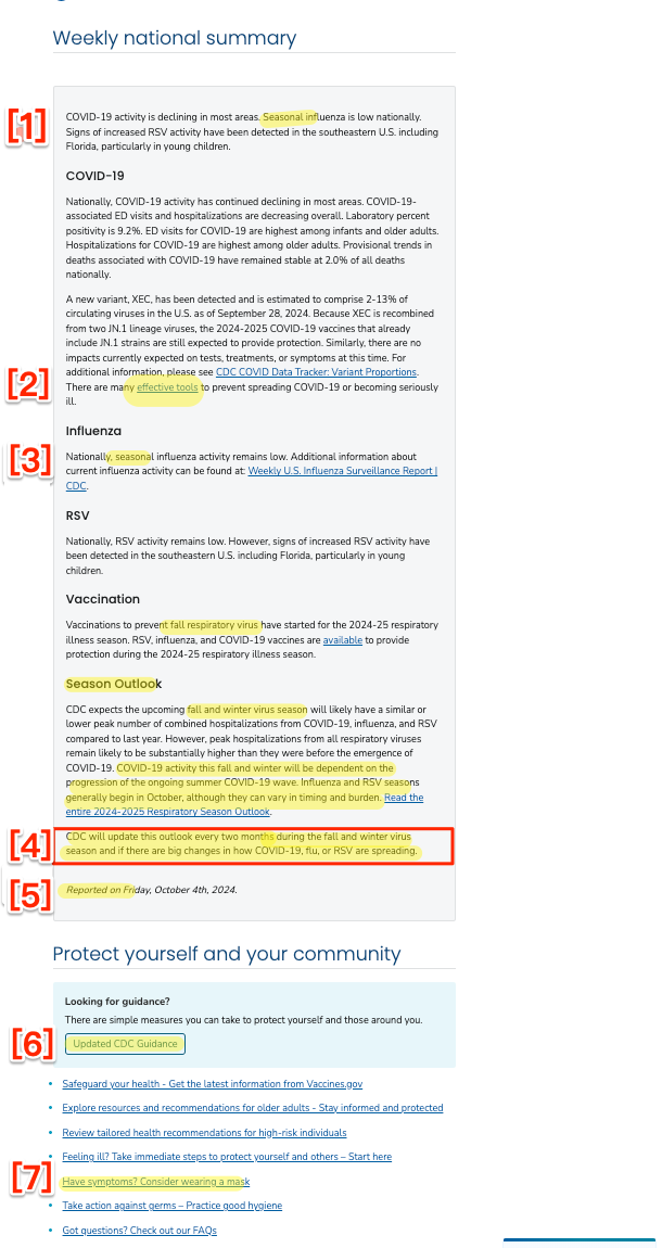
Figure 1: (b) “Respiratory Illnesses Data Channel”
Paradigm: Seasonality (Wrong)
As we see at Figure 1 (b) (1) and (3) (paragraphs one and four), CDC treats all three viruses as seasonal, and groups them all under the heading ((3) at four) as occurring during the “fall and winter virus season.”
But Covid is not a seasonal virus. From Wired (2023):
But experts on the front lines and doing data analysis say it’s too soon to declare that Covid has achieved seasonality. Looking back over the previous three years, they do see patterns: a spike at some point in the summer, such as the arrival of the Delta variant in 2021, and a spike sometime in the late fall or winter, such as the Thanksgiving surge of Omicron later that year. But those spikes haven’t occurred at the exact same time from year to year, and it’s possible they didn’t all arise for the same reasons.
From the World Health Network again (2024):
Unlike many of the respiratory viruses that you are accustomed to, COVID is not seasonal. You can enjoy a COVID-19 infection anytime during the year, as COVID-19 surges can manifest at any time…. COVID waves are not merely a fall or winter phenomenon, nor do they follow any other predictable seasonal pattern.
From the BBC (2024):
For the scientists who monitor how SARS-CoV-2 is evolving and changing, it is still almost impossible to predict when the next strains of note will emerge. While most common respiratory infections like influenza or Respiratory Syncytial Virus (RSV) follow seasonal patterns, surging during the autumn or winter months before abating in the spring and summer, Covid-19 is yet to settle into such a distinctive cycle.
In the wake of the latest summer outbreak, it remains to seen whether Covid-19 will ever become a truly seasonal virus, and if so, how long that will take.
Even the infamous CDC Director Mandy Cohen admits Covid is not seasonal. From a CDC livestream at the National Foundation for Infectious Diseases (September 25, 2024):
(COHEN:) we’re seeing summer waves and it’s telling us that COVID is not confined to the winter like flu and RSV are, it can be a year round disease, even more important for us to stay updated on our vaccine, and doing it now ahead of the winter, when we do expect more hospitalization and more death from both COVID and flu, now is the right time to get vaccinated.
From Science News (2024)
Being able to mark COVID-19 season on the calendar would be nice. At least then we’d know if we need to don masks along with our hats and gloves or with our beachwear. And there wouldn’t be so much guesswork in timing vaccinations.
For now, though, the coronavirus is on its own ever-changing timetable. Whether it eventually settles into a seasonal virus may depend on us. The strength of our collective immune systems and our willingness to take precautions to not spread any illness to others may eventually wrestle it into seasonal submission.
I suppose “don(ning) masks along with our hats and gloves or with our beachwear” is what Mandy wishes to avoid at all costs, conflicting as it would with the vax-only policy of the Biden administration. And speaking of masks–
At (2) in Figure 1 (b), the link to “effective tools” — “https://wwwdev.cdc.gov/respiratory-viruses/guidance/” is, hilariously, broken (meaning the page wasn’t carefully proofread, so who knows what else is wrong). The correct link is “https://www.cdc.gov/respiratory-viruses/guidance/”
At (4) in Figure 1 (b), we see that the seasonal outlook” will by default be updated “every two months” but only during the “fall and winter virus season.” Surely that’s wrong on two counts?
At (5) in Figure 1 (b), we see the laughable assertion that this page has been “reported.” Reporters give sources, and I don’t see a single link to any of the data.
Moving further down the Snapshot page, we come to this link: “Have symptoms? Consider wearing a mask.” Ignoring the fact that Covid-19 spreads asymptomatically, we come to Figure 2–
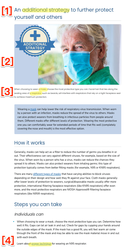
Figure 2: “Additional Strategies”
Non-Pharmaceutrical Interventions: Erased
At Figure 2 (1), we see that masking is an “Additional Strategy.” (Left unsaid is that if one goes to an airless doctor or dentist’s office with poor ventilation and no filters, it may be the only strategy.) At (2) we see that CDC, through the visual, recommends “Baggy Blues,” contradicting the text which urges, correctly, that respirators are more effective. Unfortumately, at (3), we see that CDC introduces the distinction between masks and respirators without defining either. And at (4) we see that CDC conveys the message, by burying the information at the bottom of the page and requiring a clickthrough, that N95s are complicated and inconvenient.
And finally on the Snapshot page, we come to this link “Updated CDC Guidance,” which contains the handy graphic shown in Figure 3–
Figure 3: “Respiratory Guidance Snapshot”
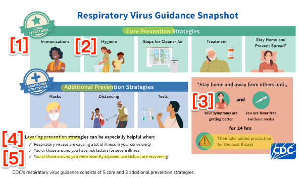
At (4), we see that CDC is in fact advocating a “Layered Prevention Strategy” (the “Swiss Cheese Model“). Assuming that the layers are listed in order of priority, with (1) vaccination (sorry, “immunization”) as a Core Strategy and first. Then, insanely, and still in Core, (2) comes handwashing. (Boy howdy, does the handwashing faction have clout.) Still in Core comes ventilation (opening windows), with again, insanely, masking (and respirations) not in Core, but in Additional. (I suppose that in every Closed, Crowded, Close Contact space, like a dentist’s office — or a store, ffs — CDC wants me first to try to get a window opened, and only then to mask. And of course at (5) the very process of asymptomatic transmission is carefully ignored. On the bright side, we see at (3) that CDC now recommends staying home for five days (not one), that IIRC people remain infected and infectious for two weeks and more.
Process: Politicized
Back to Alexander Tin at CBS:
Ritchey, who co-leads the team that coordinates data fed into the snapshots, said the CDC gathers experts from across the agency every Thursday to walk through the week’s data coming from hospitals and emergency rooms, wastewater sampling and testing laboratories.
“All those groups come together, talking through their different data systems and their expertise to say, ‘this is what’s catching my eye.’ And then that’s what we want to tee up for the public,” he said.
Sounds just like the deeply politicized HICPAC. If by two Thursdays from now these “experts” haven’t gotten links to their original data on this page, feel free to ignore it.
Conclusion
(to come)

