Hispanolistic
Markets try to shake off their Phillips curve instinct, but they just can’t. That’s why any news that is thought to increase the likelihood that interest rates will be “higher for longer” is perceived as bad for the economy and stocks. vice versaThis is not surprising, since decades of experience have taught markets that a recession reliably follows a period of tight monetary policy. (“Tightening” is traditionally defined as high and rising real interest rates, a flat or inverted yield curve, and a strong currency. But I have argued for many years that a better definition of tight monetary policy should include high and rising credit spreads.)
What the market is missing is that the Fed instituted ample reserve policy in 2009, which changed everything. Rising interest rates since then have not been bad news for the Fed. Because abundant reserves mean abundant liquidity, which stabilizes the economy and keeps credit spreads low. Meanwhile, lower inflation restores confidence in the economy, which boosts investment and productivity. This is certainly the situation today. Credit spreads are very low, which suggests that markets are functioning well and that the outlook for the health of the economy is good even as monetary policy is almost certainly tightening.
Figure 1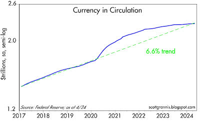
Currency in circulation (Figure 1) grew at a fairly steady pace of 6.6% per year from 2010 to 2019. It then spiked in response to massive COVID-19 relief spending. Over the past few years, the pace of currency growth has slowed dramatically, with currency in circulation growing just 1.3% over the past year.
If the trend line in Chart 1 represents “normal,” then the chart suggests that the money supply (in the form of currency) is currently in line with the demand for money and monetary conditions support a low inflation outlook. (As we’ve said before, the supply of money always equals the demand for money because unwanted currency is simply returned to banks in exchange for deposits.)
Figure 2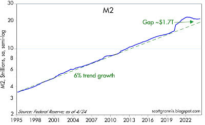
As shown in Chart 2, M2, a measure of the money supply, grew at a fairly steady pace of 6% per year from 1995 to 2019. It then spiked by about $6 trillion as a result of the monetization of $6 trillion in COVID-19 “stimulus” checks. Over the past two years, M2 growth has been flat to negative; as the chart suggests, it is only slightly higher now than it would have been without COVID-19 spending. By this measure, monetary conditions have gone from very accommodative to quite tight. They are tight because the money supply is shrinking, inflation is falling, real yields are relatively high, and interest-rate sensitive sectors of the economy (such as housing) are suffering.
Figure 3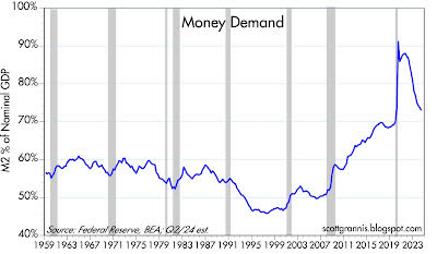
“Money demand” as I define it is best expressed as the ratio of M2 to nominal GDP, which can be thought of as the amount of cash the average person wants to hold relative to their annual income. Chart 3, like the previous two charts, shows that monetary conditions have returned to near normal. Demand for money surged during the COVID-19 crisis but reversed as the economy bounced back. Money demand is now nearly back to pre-COVID levels. There is no longer a huge surplus of unnecessary money to drive prices up.
Figure 4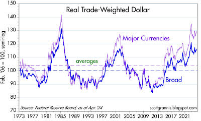
Figure 4 shows the value of the dollar for The basket of major currencies is relatively small, and the basket is large. Most importantly, this chart is an excellent indicator of the purchasing power of each country’s dollar because it adjusts for inflation differences. By any measure, the dollar today is pretty strong from a historical perspective. Tight monetary policy works like this: attractive interest rates and confidence in the Fed’s ability to contain inflation increase demand for the dollar relative to other currencies.
Figure 5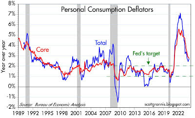
Figure 5 shows inflation rates according to the headline and core versions of the personal consumption deflator.Clearly, what the Fed has done over the past two years has led to a significant decline in inflation.
Figure 6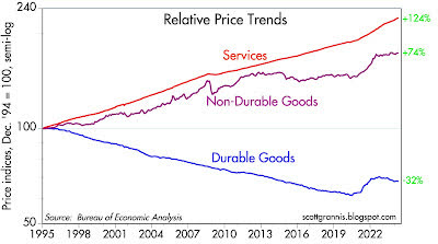
Figure 6 shows the three main components of the personal consumption deflator. We can see that durable goods prices have actually fallen over the past year, while nondurable goods prices have increased slightly. The only significant source of inflation is the wage-dominated services sector. It is not uncommon for wages to lag price increases in other sectors. Therefore, wage growth is likely to moderate going forward, which will help headline inflation fall to the Fed’s target.
Figure 7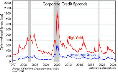
Exhibit 7 shows that corporate credit spreads are very low compared to historical standards, which is a signal in the bond market that investors are fairly confident about the outlook for corporate earnings and, by extension, the future health of the economy.
Figure 8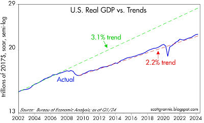
I have been updating and publishing Chart #8 for at least the past decade. To this day, I am surprised that it has not received more attention. The 3.1% trend line (green) represents the trajectory of economic growth from 1965 to 2007. The 2.2% trend line (red) represents the growth trajectory that has pretty much dominated since mid-2009. If the economy had resumed the 3.1% growth trajectory after the Great Recession of 2008-2009, the economy would be effectively 25% larger today (a 1% annual decline in growth makes a big difference). What is causing today’s slow growth? That should be at the center of our national debate. In simple terms, the economy is being sapped by 1) excessive government spending, 2) rising tax and regulatory burdens, and 3) rising transfer payments.
Figure 9 Figure 10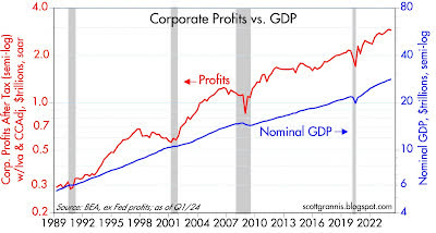
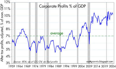
Charts 9 and 10 compare the level of corporate profits to the nominal size of the U.S. economy. By both measures, profits are exceptionally high. If this is the price of “tight monetary policy,” then let’s have some more tight monetary policy! (Note: profits and losses generated by the Federal Reserve’s ample reserves are excluded from overall corporate profits.)
Figure 11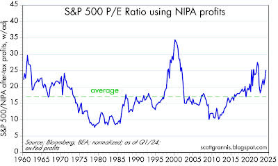
At a macro level, a traditional measure of stock valuation compares the stock price to the sum of after-tax corporate earnings over the past 12 months (Price Earnings Ratio, PE). Figure 11 does the same thing, but using the level of after-tax corporate earnings calculated from the National Income and Product Accounts for the past quarter. This is a more timely and consistent measure of earnings calculation than the traditional PE ratio (credit to Art Laffer, who has used this methodology for over 40 years). By this measure, stocks are relatively expensive, but not excessively so.
Figure 12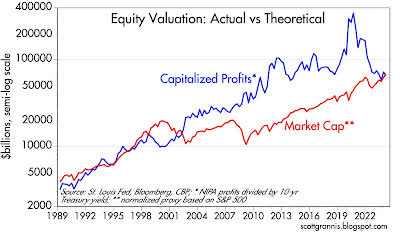
Again borrowing from Art Laffer, Chart 11 compares the theoretical level of corporate earnings (calculated as the capitalized value of NIPA earnings – earnings divided by the 10-year Treasury yield) with the market value of stocks as approximated by the S&P 500. Note that according to Chart 12, stocks were significantly “overvalued” in 2000, and according to Chart 11, they were also very overvalued then. However, today stocks appear to be properly valued, with real and nominal valuations roughly equal. The 10-year Treasury yield drives and explains the difference between these two measures of stock valuation.
This means that lower interest rates (which should follow lower inflation) make equities more attractive as an asset class. This is, simply put, the “Fed put” I mentioned in my last post: Tight monetary policy has not hurt the economy at all.
Editor’s note: The summary bullet points for this article were selected by Seeking Alpha editors.


