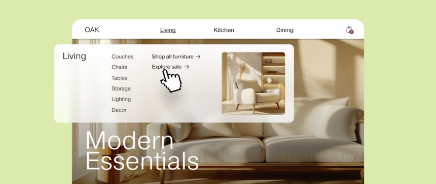
Your website’s menus can make or break a shopping experience. Customers browsing your e-commerce store can either get lost in a maze of options or make a quick purchase. For stores with a lot of content or a complex site structure, mega menus can be especially useful as long as you keep the user in mind. Learn how you can harness the power of mega menus to boost your sales.
What is a Mega Menu?
What is a Mega Menu? Menu Type It displays several different categories in a large multi-column format that does not require scrolling. Mega menus are usually displayed in the header of a web page, but like other styles of menus, they can also be displayed in the sidebar or footer.
When a user clicks or hovers over the main menu, a panel expands and grows, usually filling the entire page, and displays links to specific categories that were not previously visible, as well as rich content (images, product or brand descriptions), whereas a traditional drop-down menu typically displays only one group of links when the user hovers over a menu item.
For example, an online store that sells a wide range of home and clothing items for all ages might install a Navigation Menu widget that allows them to create a mega menu. Once the widget is placed on their site, the menu will display text, links, and images within each menu category.
How Mega Menus Organize Your Content
A grid layout typically displays categories and subcategories in rows and columns instead of a single list. A combination of top-level menu items, second-level menu items, and so on organizes large amounts of information along a clear path. To further reduce confusion, mega menus use generous white space (space free of text, images, or other visual elements).
Even if you use a mega menu plugin, Max Mega Menu Or combine custom CSS, JavaScript and templates for your menus, aiming for a responsive mega menu that adjusts to the width of your target screen size and works on phones, tablets, laptops and desktops.
Benefits of Mega Menus
Here’s how mega menus can provide a positive user experience for your customers and benefit your business:
Enhanced navigation
Mega menus have more levels than dropdowns, allowing you to display deeper layers of your website structure. You can display subcategories alongside other subcategories to show the hierarchy and content organization of your site, giving website visitors a clear path to specific content. This reduces the need for scrolling, saving shoppers time.
Increased discoverability
Because mega menus expose more of your site’s content, users are likely to click on links they wouldn’t have found otherwise.
Featured Content
Mega menus provide a space for featured content. You can add photos, GIFs, calls to action, or anything else that will add visual interest. You can also use this space to encourage your visitors to take a specific action. For example, you can feature a special offer prominently in your menu to pique your visitors’ curiosity.
High-quality mega menu examples
The following website mega menu example incorporates creative design and functionality.
Crockett & Jones
Crockett & Jones You sell high-end, handmade shoes. Each menu item in the top navigation row displays an attractive mega menu that spans the entire page.
For example, the Men’s Shoes category breaks down products into three columns: by style, by collection, and by season. There’s still room for product photos and descriptions on the right. As you hover over each item in the mega menu, the view on the right changes. You can browse and read about the entire line of footwear products without leaving the menu.

Designated Outfitter
Designated Outfitter sells high-quality, sustainable t-shirts and clothing that it designs and prints in-house in Benton, Arkansas. On their website’s menu, most navigation options open into a sleek, simple, full-page mega menu when you hover your mouse over them. Mega menus allow the brand to display a large number of links in a simple format. For example, their brand category has 19 links spread across four columns. With a standard menu, visitors often have to scroll down to see all of their products.

Belstaff
BelstaffThe mega menu of has various contents. For example, the men’s and women’s category contains the history of the 100-year-old clothing store, the various collections that interest visitors, categories and subcategories, and Some product imagesUsers can see what the site has to offer.

Our Location
Our Location manufactures and sells cookware, tableware, appliances, and kitchen tools that enhance the taste of home cooking. Each menu item in the top menu bar opens an attractive, full-width mega menu. These menus are concise but optimize the visual space to showcase sale items and best-selling products with accompanying product photos.

Archer & Olive
Archer & Olive is a stationery company that specializes in notebooks, notepads, and accessories for journalers. The top navigation has just three items: “Shop,” “Learn,” and “First Time Here?” Each opens a differently styled mega menu.
The shop menu has text links and is neatly displayed across five columns with plenty of white space. The learning menu includes background information on the brand, educational content, and links to pre-orders, with photos underneath to fill the bottom menu space. The final menu pairs three category links (recommendations, mental wellness, and creative journaling) with photos to frame the customer experience.

Mega Menu FAQ
What is the difference between a dropdown menu and a mega menu?
While a drop-down menu displays a single list of links, a mega menu displays a wide range of links in an organized layout, making it easy to navigate between multiple levels of your website.
What are the disadvantages of mega menus?
Mega menus are ideal for websites that feature a wide range of product categories. Accessibility and adaptability to mobile devices may also be an issue. Test the behavior of your mega menu with a screen reader to ensure it looks and works as intended.
What is the best use of mega menus?
Mega menus are a great choice if you have a large product catalog: by flattening your site architecture, you can display multiple categories and subcategories in one layout, reducing the need for users to navigate deeper layers.
Are Mega Menus Helpful for E-Commerce Websites?
Mega menus are especially useful for e-commerce websites with a wide product line and multiple categories. Mega menus provide shoppers with a quick and easy browsing experience, leading to increased sales.


